
Maila Maternity Health a Berlin-based medical startup that leverages user data to provide better health outcomes for both mothers and babies.
As the 4th member of the team, I was brought on as the principal designer to develop the brand identity and design the mobile app. My role also expanded in a mentorship capacity to support a UX research apprentice.
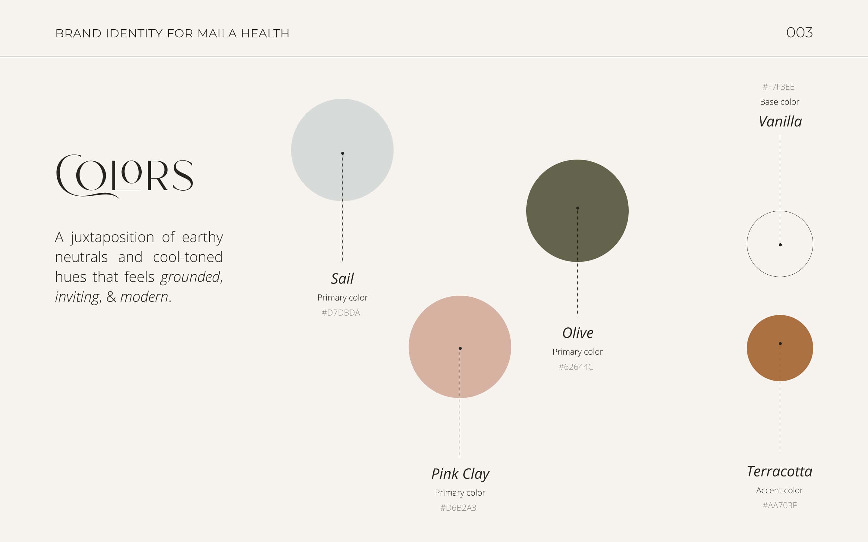
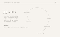
Since I would be designing the brand from scratch, I first met with the CEO to discuss the company's mission, values, audience, and competitors. The vision was to create something calming, approachable, and modern, while also embracing gender neutrality (a key opportunity for market differentiation).
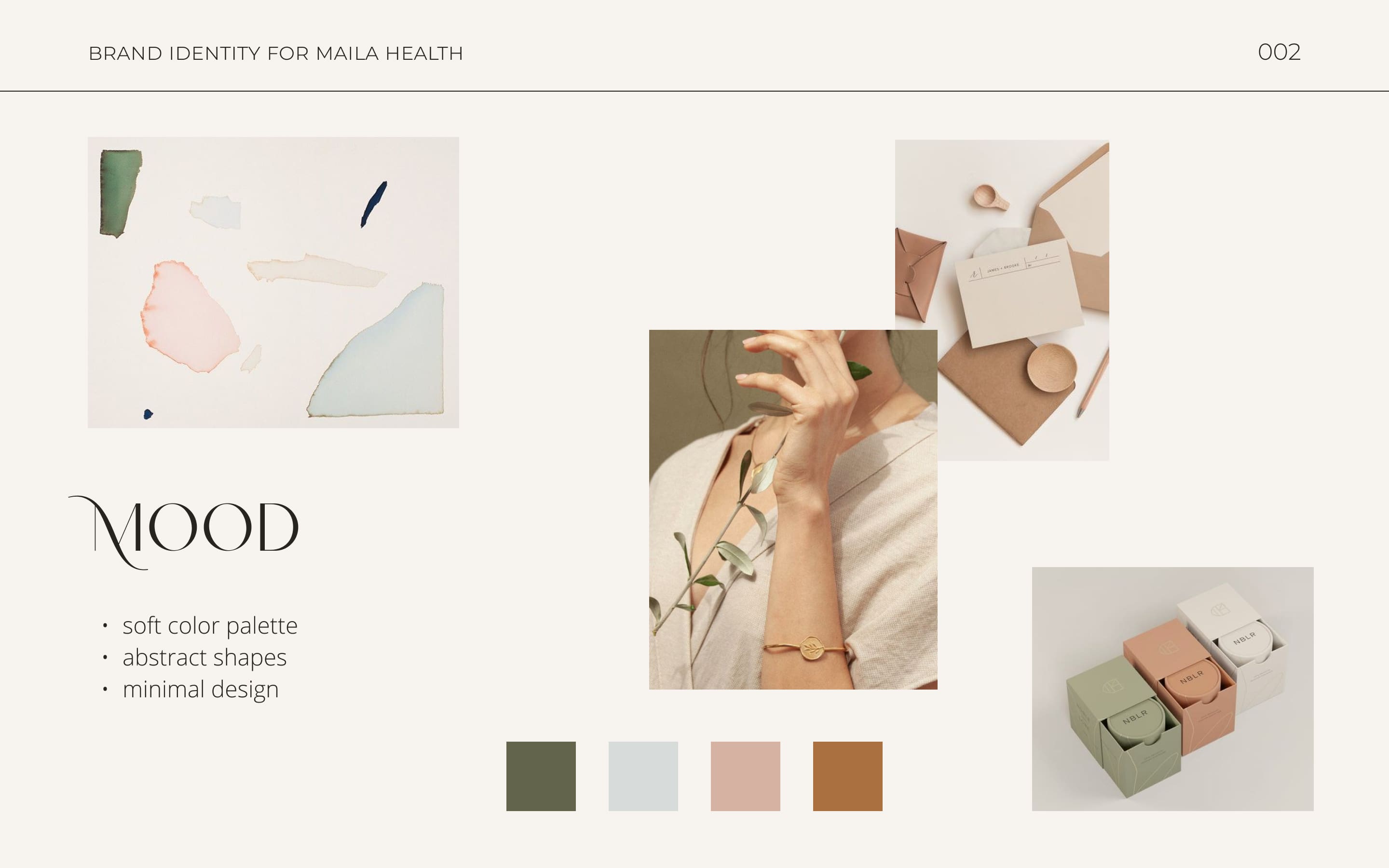
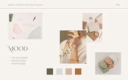
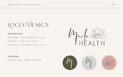
I created a set of moodboards for the colour palette and overall brand direction—and we decided on one that included soft colours, organic shapes, and clean lines (see below).
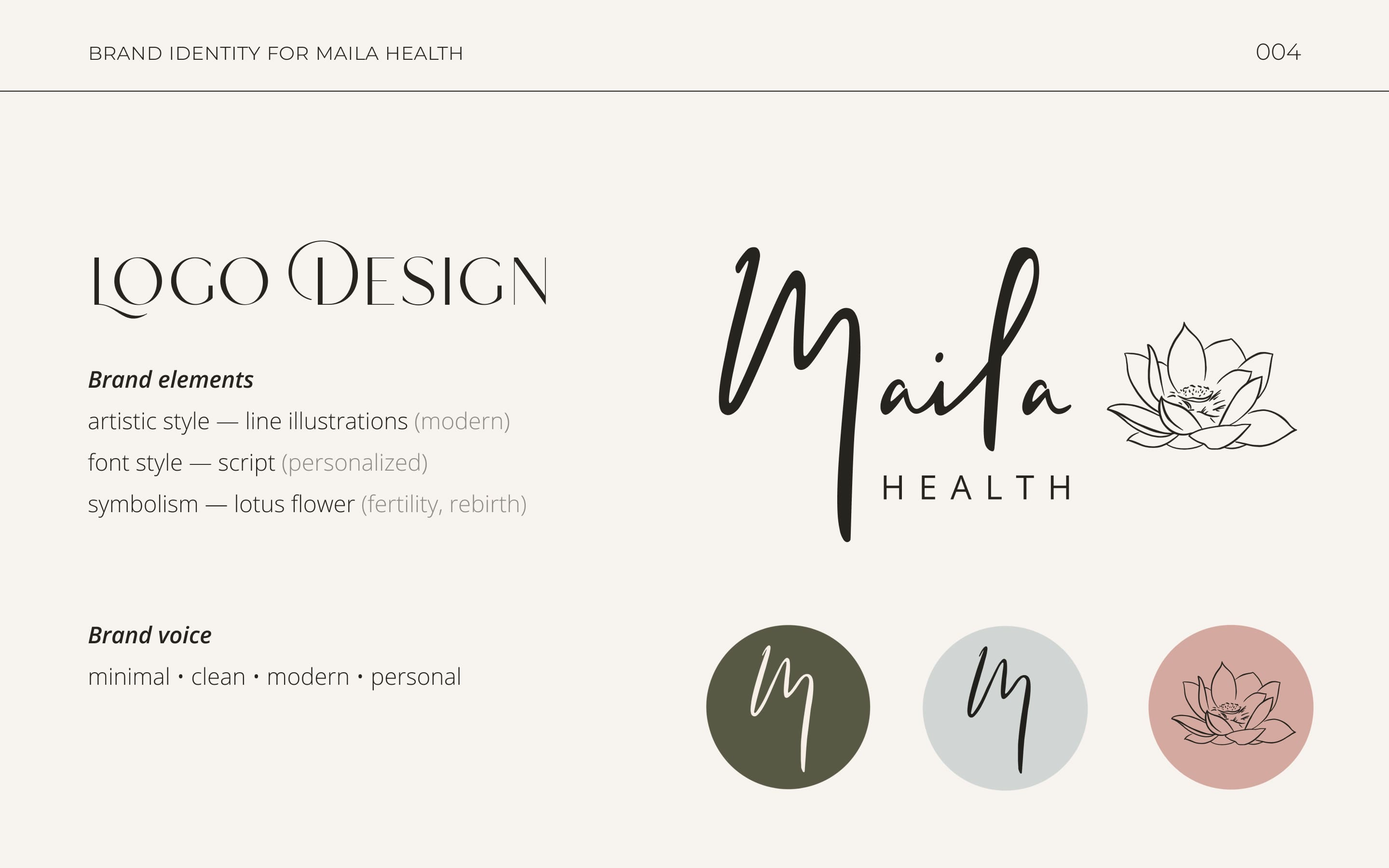
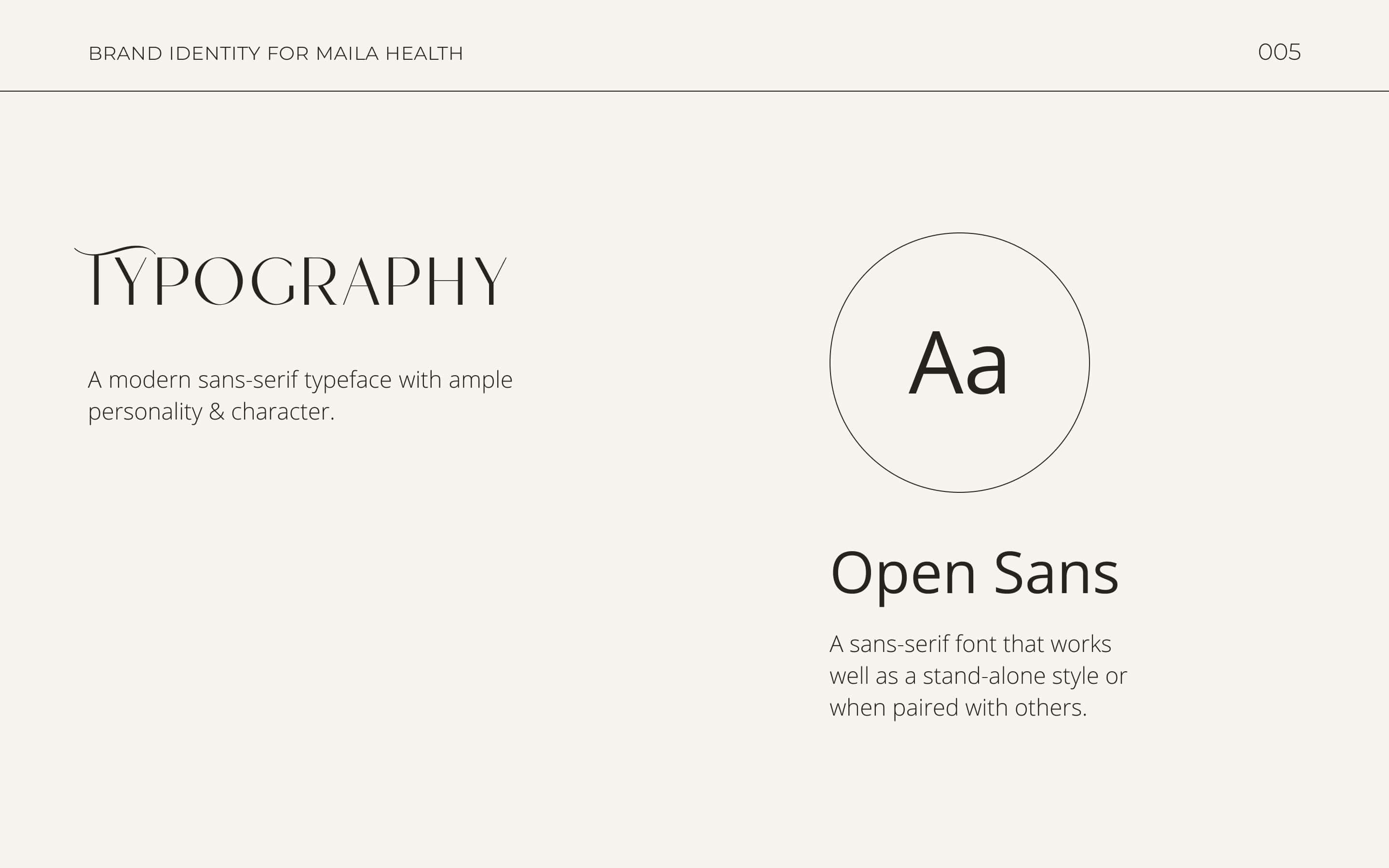
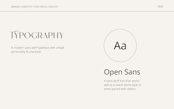
To give the brand a personal touch, I designed the logo using my own handwriting and a simple line illustration of a lotus flower (a symbol of rebirth) for the brandmark. For the core typeface, I selected a sans-serif font to imbue a modern feel while also balancing the ornate elements of the signature and illustrations.


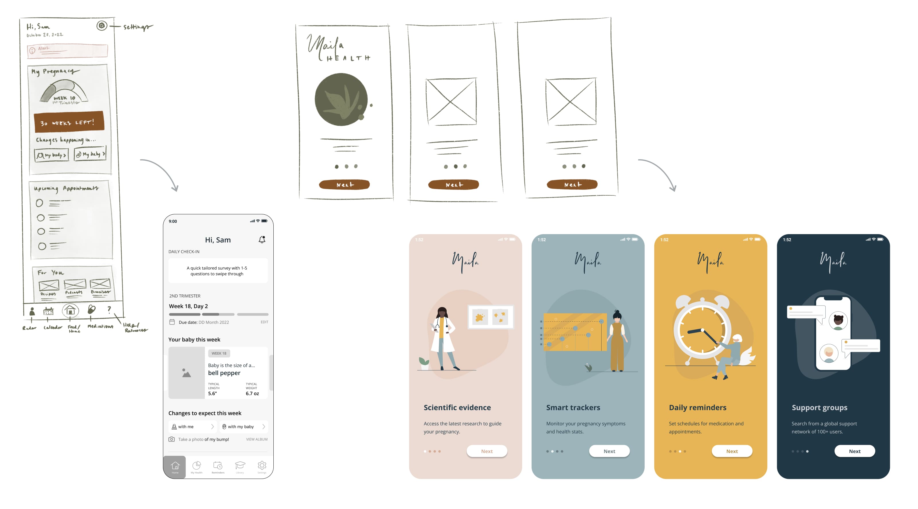
I began by mapping out the required features in Miro and held several brainstorming sessions with the team to narrow scope. Since the app had a tight deadline for development (the company was funded almost exclusively by a university grant), this refinement process helped ensure the architecture would be technically feasible to develop.
I created wireframes of varying levels of fidelity for five key user flows. As designs evolved, the colour palette also went through a number of changes (see early concepts below). While beautiful on a computer, the original muted palette just didn’t read well on a small mobile screen. Instead, I opted for a bolder palette of navy as the core brand colour with pops of contrasting hues as accents.
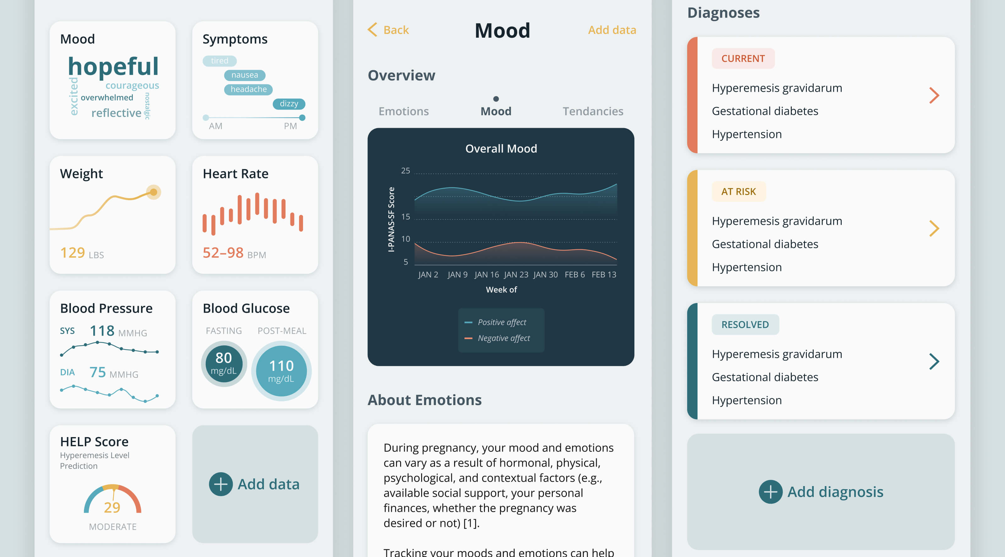
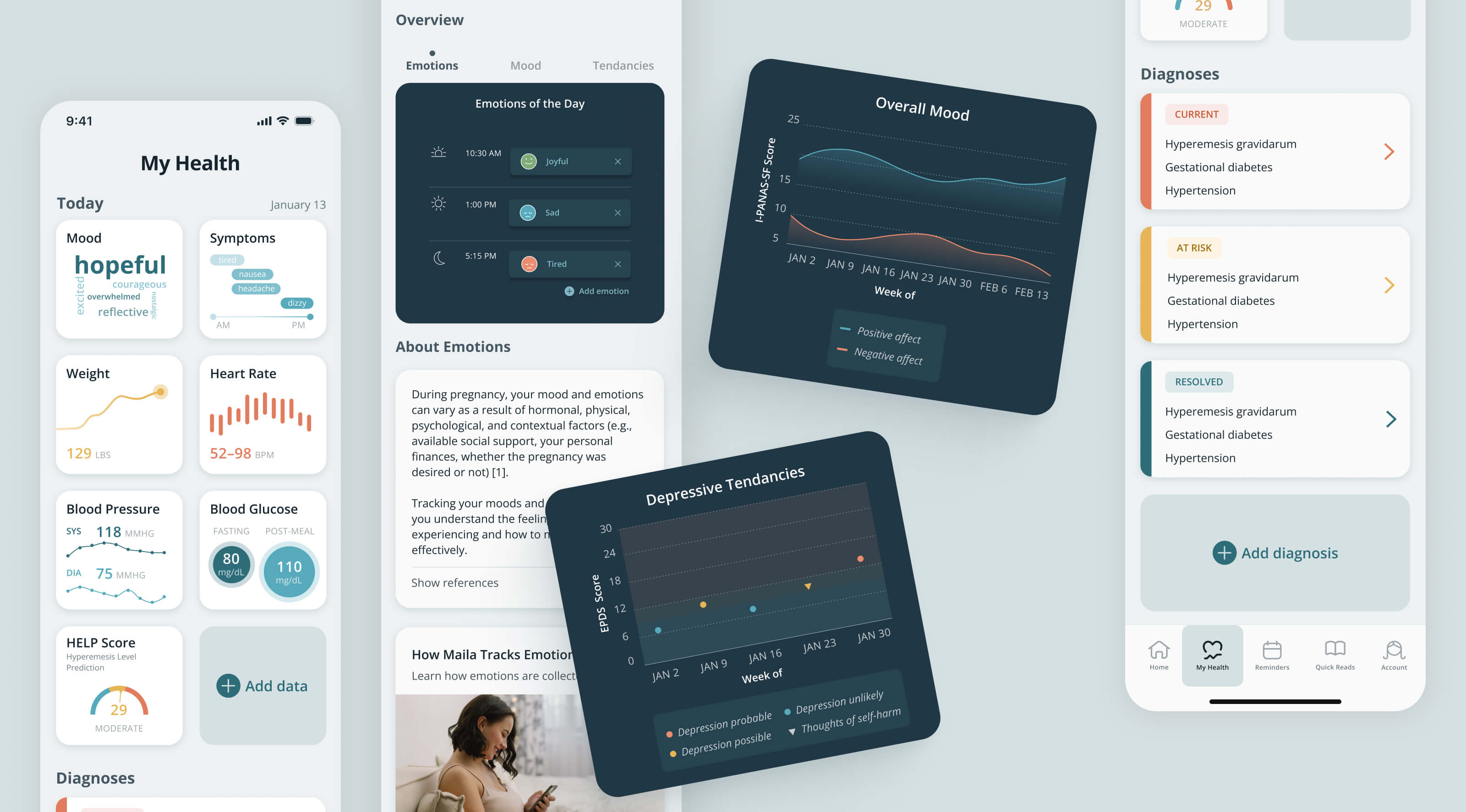
In terms of complexity, the My Health tab (below) was by far the most difficult to design. This tab would allow users to log various health metrics such as mood, pregnancy symptoms, weight, etc., and then use these data to identify trends and suggest content. Due to the different types of data involved, each health metric required its own unique design.
The other challenge was making sure the suggested content was both accessible and easy to understand for a variety of user groups. For example, since all articles needed to be medically reviewed, I used expanders to hide cited sources and help reduce cognitive load. In hindsight, I would have also added information icons beside each of the diagnoses to explain the medical terminology in layman's terms.
To ensure successful hand-off to engineering, I prepared a design package containing the information architecture, user flows, and design system. The first version of the app released in the App Store (Europe only) in 2023.


