
As a small tech startup, Pathcore’s software had been built with minimal design input and documentation. The exiting Figma file didn’t distinguish between implemented and deprecated designs, and it also lacked a design system. This significantly slowed product delivery, as each new feature needed to be built from scratch and manually checked for consistency against the current implementation.
The lack of design process also created challenges. Design tickets were often ambiguous and contained little context to support the highly technical requirements.
As a result, products had accumulated an enormous amount of design debt—and, as the only designer, I needed to close the gap quickly.
To reduce further design debt, I knew we needed a design system—but I couldn’t start until I had a solid understanding of the product.
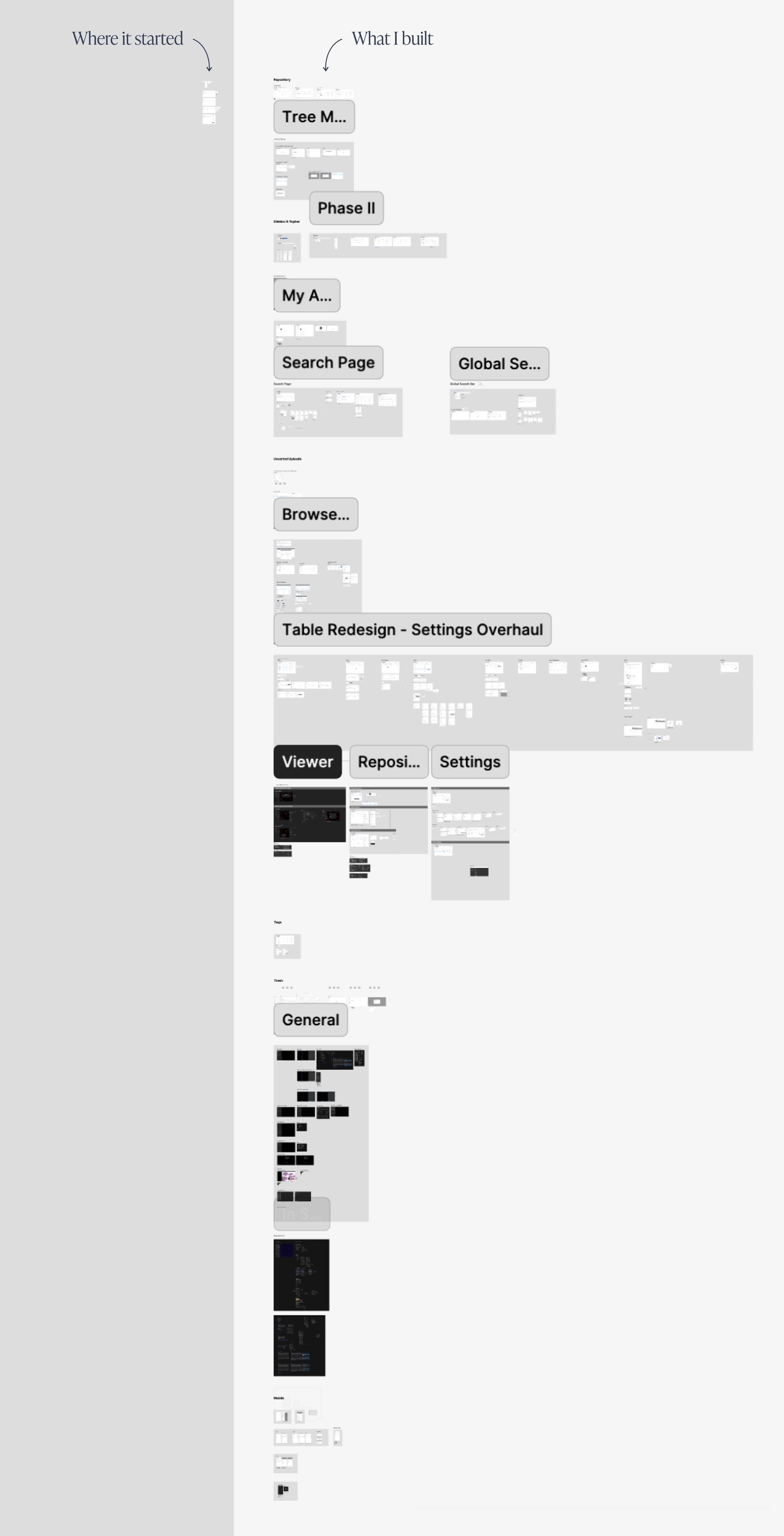
I audited each design in Figma against the current implementation, collaborating with stakeholders to clarify functionality and revise unclear requirements where necessary. Only a few designs remained, which I gradually refined and expanded until all core product features were fully rebuilt (see comparison below).
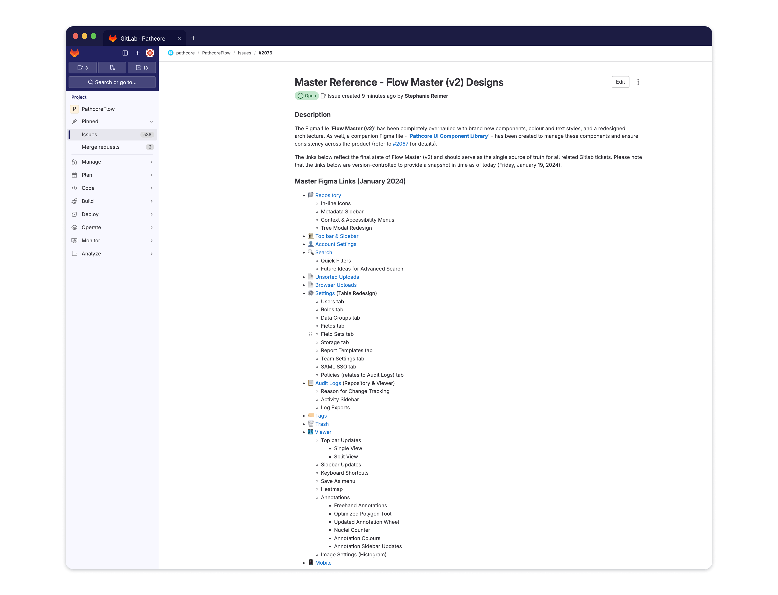
This work also led to a new design documentation process involving version-controlled links in Figma.
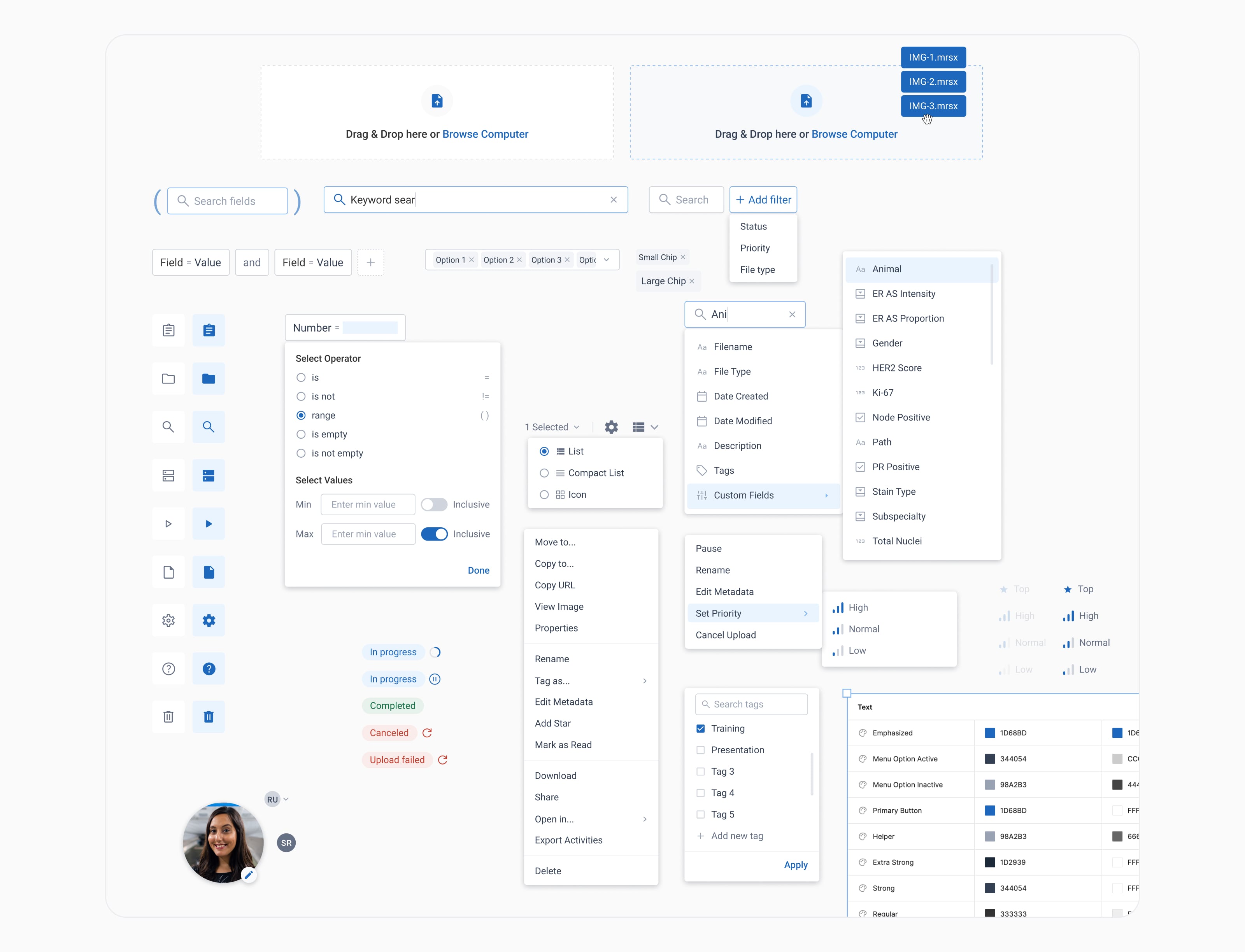
Using Brad Frost’s Atomic Design framework, I created over 200 new components ranging from simple buttons to complex filters, as well as colour variables for text styles, buttons, icons, and backgrounds in both light and dark modes. A handful of these components and colour variables are captured below.
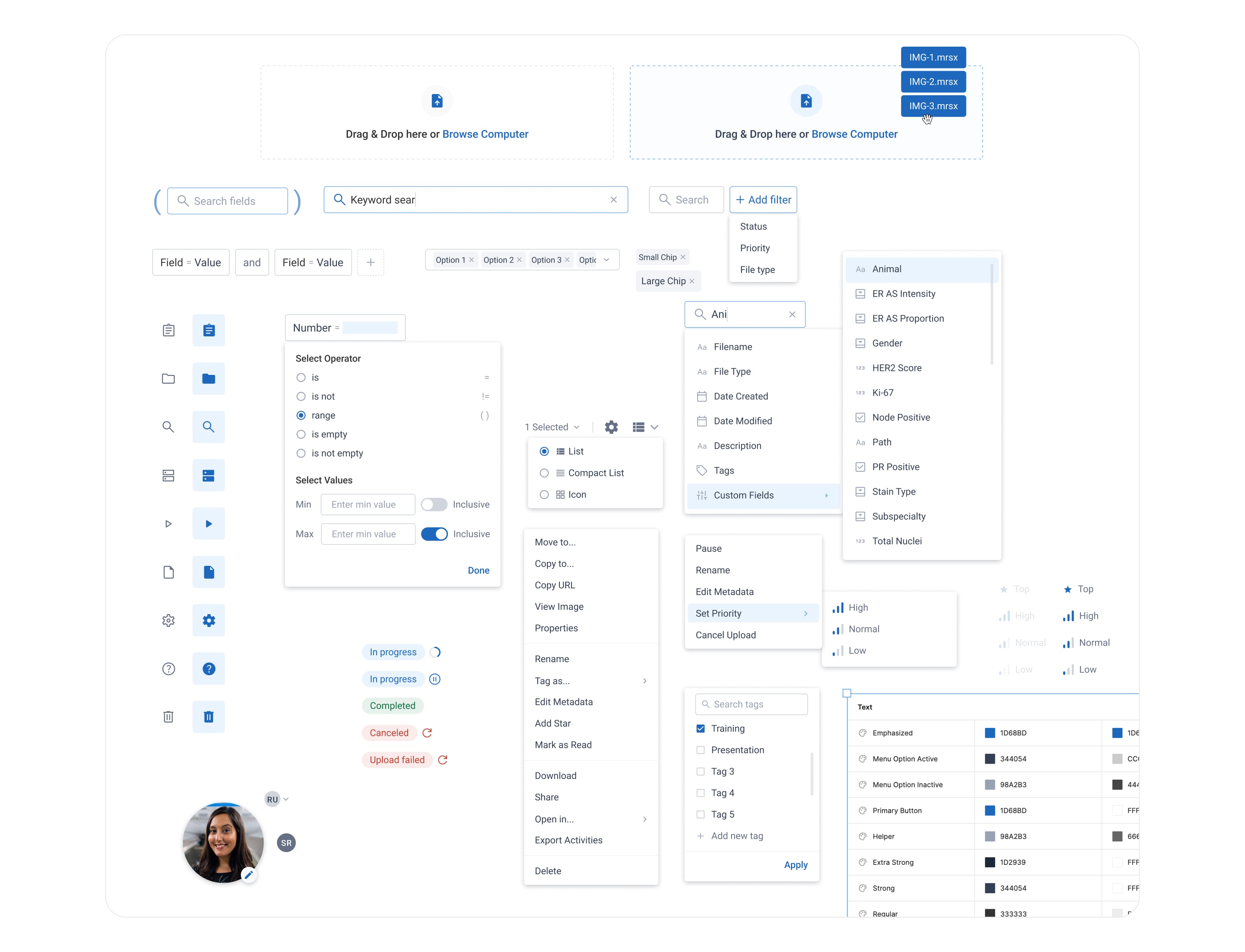
At the same time, I saw an opportunity to modernize the interface. I pitched and implemented a new colour palette and icon library, and updated core elements such as data tables, context and accessibility menus, and side/top bars.
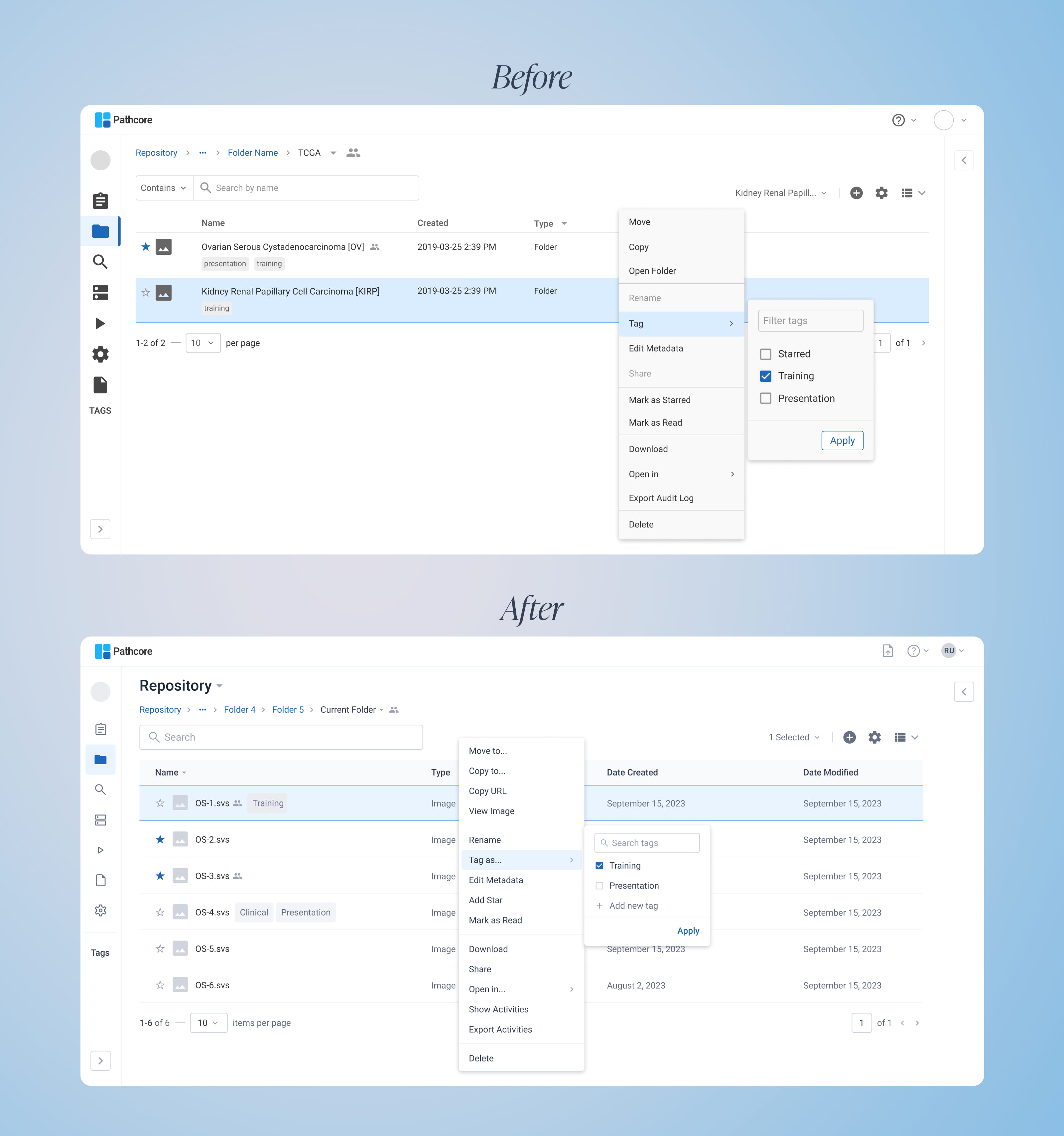
The use of components significantly streamlined the design and development process. I was able to build designs faster and with less manual effort, and the development team now had a detailed framework that could be translated into code.
Most importantly, users were genuinely excited about the software’s new look and feel—a sentiment they shared during product demos showcasing the updated UI.


